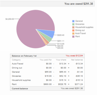
If you are a Splitwise user, you might have noticed this month that we added pie charts to our monthly summary emails. Ryan and I figured out how to do this the night before the emails went out – we were surprised how easy it was to do with the Google Charts API. Technical gibberish after the jump.
There are actually two Google charts APIs, which are confusingly not well documented on the Google charts site. Well, they are both well documented, but in different places that don’t acknowledge each other’s existence very much.
There is a newer, sweeter one for interactive charts, but these require Javascript, which doesn’t work in email, of course. This chart wizard for the older Google image chart API made it quite easy to embed images into our emails based on a wizard. The link gets created for you on the right hand bar. Editing the link code based on the output of some Rails queries was relatively easy, once we figured out how to encode the data in the link as text.
For simplicity, you may want to pass the raw data in the link too, in which case the link will have to include “chd=t:” and then the data separated by commas. This is instead of “chd=s” which will come before some encoded gibberish by default.
If you have any Google charts questions, feel free to post them below and I’ll try to answer if I know. Happy chart making!
Hi there! Is there a way to get previous months expenses in chart form as a way to track expenses by category? Thanks much!
Right now we only offer the spreadsheet breakdown for past monthly expenses. Chart views for previous months is something we plan on doing at some point, though I don’t have a hard date for you. Sorry!
Hey,
Like the person above told, I was wondering if we could see the past months breakdown as pie charts. Have you been able to resolve this issue yet? It would be great if we can see that. It will help to compare previous months such as how much we spent on groceries, gas, restaurants etc..
I have recently made an account and loved it. Thank you very much..!
We’re planning on bringing that feature online very soon!
Hi, Thanks for your App. I Love this so much. I am eagerly waiting to see year-wise spreadsheet and pie-diagrams!!!