Today, Splitwise is launching a major refresh of our popular Android app.
We’ve rebuilt all the most important screens in a modern new style. Improvements include:
- Clean look and feel that embraces modern Material Design
- New layout that speeds up task completion
- Updated balance presentation, for greater clarity around who owes who and why
- Better interface for unequally splitting an expense
- Enhanced discoverability of important features
- Small quality-of-life improvements throughout the app
Our goal for this redesign was to keep Splitwise easy and simple to use, while refreshing the interface to feel modern, clean, and polished. The Splitwise team felt (and some of you told us) that the Android app was starting to show its age. These changes represent a big step forward.
Here’s a detailed look at what’s new.
Modern look and feel
Splitwise for Android version 5.0 thoughtfully leverages Material Design for a more pleasant, platform-native experience. Changes include:
- A bottom navigation bar
- A coherent color palette that provides higher contrast for increased readability
- Standardized iconography
- Adoption of system components where appropriate, such as the default date picker
Under the hood we have also embraced modern Android technologies such as Kotlin, fragments, and theming. These tech changes will help our team ship faster, better updates going forward and lay the groundwork for adding Dark Theme and right-to-left language support in a future update.
New tab layout
Splitwise users can share costs with groups (“Groceries with Roadtrip”) and individual friends (“Groceries with Ana”). Both capabilities are very important, but we know groups are the most common unit of organization and the place where most transacting occurs. Splitwise for Android version 5.0 establishes “Groups” as the leftmost and default tab for most new sessions (in previous versions, “Friends” had this spot). Our beta testing showed this change speeds up task completion for most people.
We’ve also introduced a new visual language to discern groups from friends in the interface. Now, groups are represented by rounded rectangles, while friends are represented by circles.
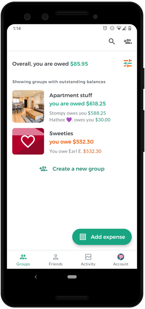
Balance presentation

The redesigned app gives more real estate to group/friend balances, so folks always know their total balance (“You are owed $40 overall”) as well as the recommended repayments that add up to that total (“Ana and Bob each owe you $20”). We’ve brought this change to iOS as well.
We’ve also created more educational content on our powerful “simplify debts” feature, to help everyone trust the final balances and feel confident about Settling Up.
Add expense
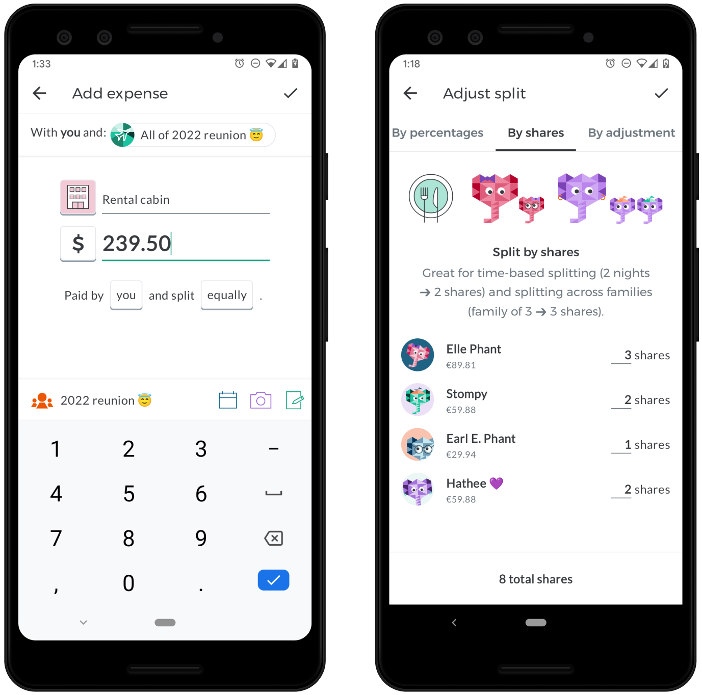
We refreshed the add expense form to improve ease of use. Most notably, we built a new interface for splitting expenses unequally. The changes make it easier to know which split method is best for a given scenario and enter all the amounts.
Settle up
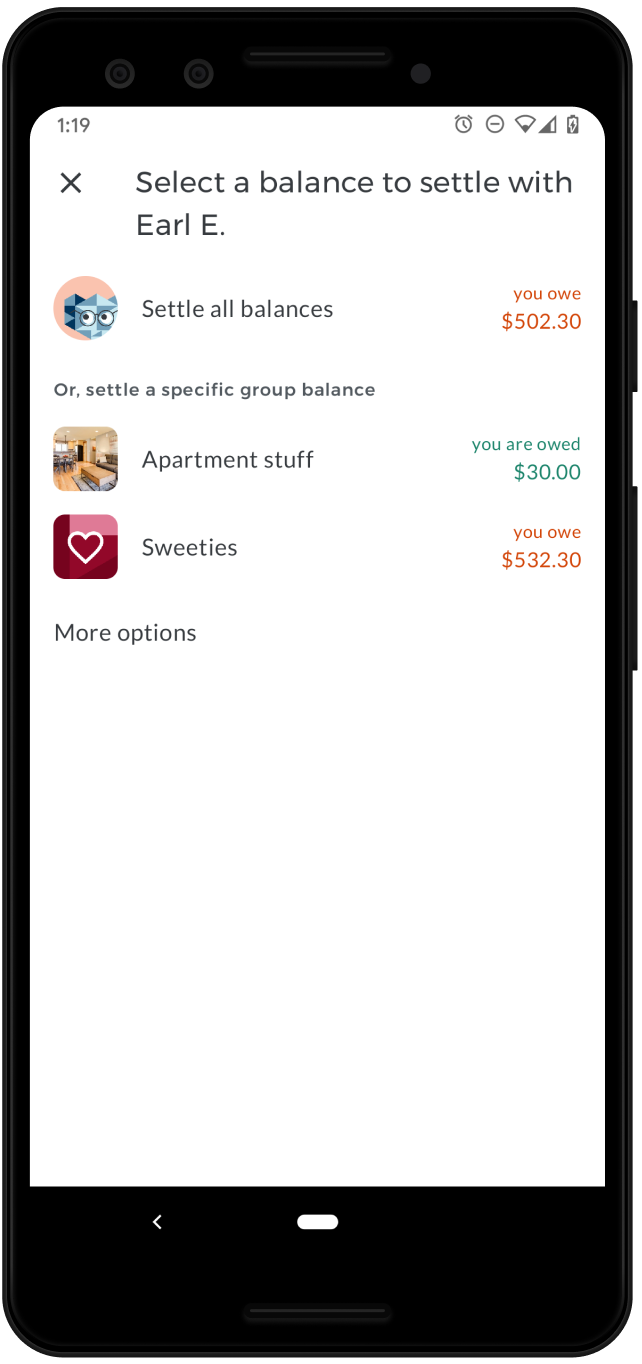
One of Splitwise’s strengths is that you can see a presentation of a total balance with a friend, across all group and individual expenses shared. This release adds the ability to settle a specific group balance in addition to the total balance.
Group and friend details

Of the many changes to this screen, the biggest improvement comes from getting rid of the overflow menu, to help users find the many powerful and important capabilities that were hidden there. We’ve moved these features into a horizontally scrolling list of buttons that can be used without opening another menu.
We’ve also added the date of each expense to the expense list, a popularly requested change that should make it easier to stay on top of changes and discern this week’s grocery run from the last.
Expense details
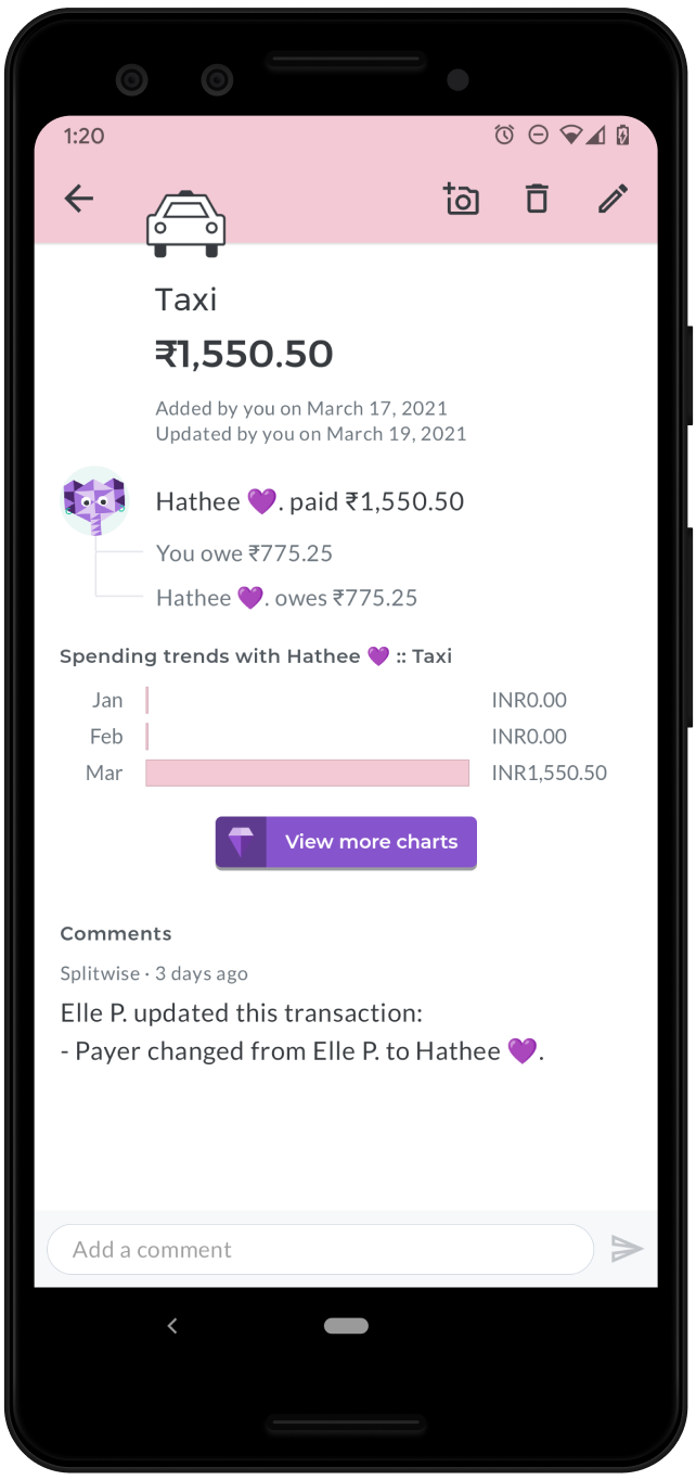
The new expense details screen is majorly improved in terms of layout, with many quality-of-life improvements for editing, deleting, categorizing, and commenting on specific expenses. Budgeters will love the quick categorizer button for tagging uncategorized bills. It’s also much easier to get to the receipt upload button for attaching an image to an existing expense. We’ve also added a sticky comments bar to better facilitate conversations around shared spending.
Group settings
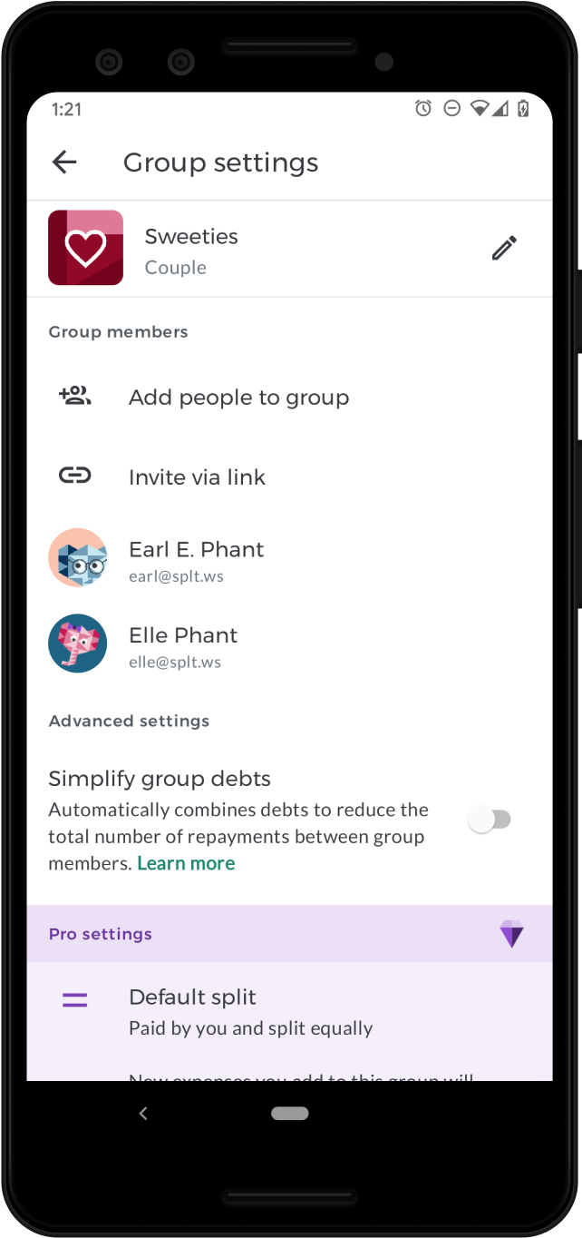
The updated group settings screen contains many small layout improvements, and makes it easier to manage members by clarifying who can/cannot be removed.
We’ve also added a new group type for couples. From surveys and app reviews, we know that millions of couples already use Splitwise to manage their relationship finances. Creating a dedicated group type for couples will also allow us to build special product features for couples in future releases.
Account tab

We did away with the hamburger menu for account settings, instead introducing a dedicated tab for account management. The layout of the buttons and options there is improved, and should be more familiar to Android users. Head here to upgrade to Splitwise Pro, add a phone number to your account, or change your notification settings.
Feedback and thanks
If you have feedback, praise, complaints, or other thoughts about the new Android app, please reach out to hello@splitwise.com or use the Contact Us option in the Account tab to get in touch. We read and respond to every email, generally within 1-2 business days.
To all our users: thank you so much for continuing to support Splitwise. We’re so excited to share this new Android app with you, and for all that’s yet to come.
